By Bowen Hobbs
In March 2021, I was tasked with developing a brand for our newest Lab, AwesomeAPI. Some of the initial questions were obvious. How visually connected should this new brand be to Lincoln Labs? Same fonts? Same colors? Or should it be something totally different that stands on its own? Which audience are we trying to connect with? What feeling(s) are we trying to evoke?
The Journey to an Identity
With those questions in mind, I started crafting logo concepts. The initial attempts were pretty tech-inspired. We started with a black-and-green color palette and monospace fonts like we were coding The Matrix ourselves. Honestly, it was too much.
Our next set of logo concepts has a distinct midcentury flair, leaning on the dimensional signage of the era. While we liked these ideas, something wasn’t quite right. And how would these marks perform when they were reduced to the size of a dime? Not great. Too much detail and too much… muchness?
Going back to basics, we moved toward simple sans serifs fonts, attempting to craft a wordmark and icon that paired well. Although we didn’t have an approved logo yet, we were making progress. We managed to answer some of the questions above.
The Questions Revisited
How visually connected should this new brand be to Lincoln Labs?
Not too connected, but both icons should look good next to each other on a black background.
Same fonts? Same colors? Or should it be something totally different that stands on its own?
Black is a mainstay across the brands of most of our Labs, but each Lab has its own visual language including its own fonts and colors.
Which audience are we trying to connect with?
We were still trying to connect with people who build software, but we were also trying to establish a connection with their bosses to show the business case for unified APIs.
What feeling(s) are we trying to evoke?
This ended up being the money question. More than anything, we wanted to show the joy of taking something that is expensive and difficult to do oneself and making it simple and painless. The pure joy of not having to schedule, fund, or worry about integrating with every other piece of software your customers use.
And then it hit us:

The Execution of the Brand
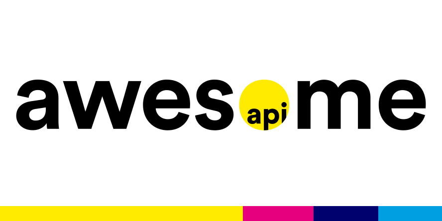
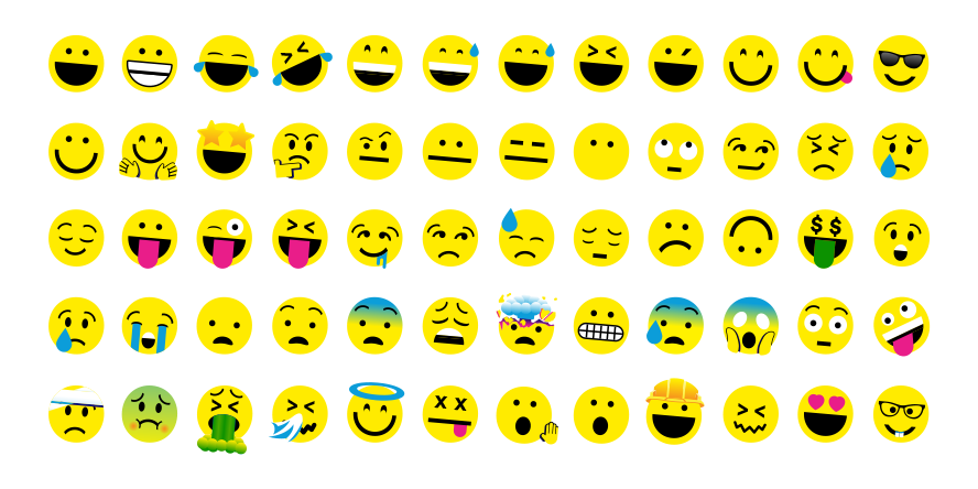
The yellow dot has the power to transform into any number of emojis, giving AwesomeAPI the ability to describe the varied emotions of joy, worry, sadness, frustration, and relief with ease. The very same emotions that anyone who has ever built anything has felt. Feeling overjoyed that everything works? There’s an emoji for that. Feeling nervous about a data transfer? There’s an emoji for that too. Feeling like a total nerd for discussing software integrations in detail? Same here, and there’s definitely an emoji for that as well. So we built out an entire set of emojis to describe that range of feelings.

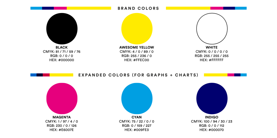
At that point, we had a logo, two of our colors, and a font: the semi-formal but very friendly Circular Std. However, we needed to round out our color palette. To help maintain the fun of the brand, we added cyan, magenta, and indigo resulting from the overlap of the first two, giving us a good array of light, bright, and dark hues to choose from and mix together.

We now had the bones of the brand, but we needed a few more pieces to make it come to life. To further develop the storytelling aspects of the brand we created a series of spot illustrations to describe not only the integrations themselves but also the pieces of data they connect for our clients. These illustrations have the same styling as the emoji set we created as if they were part of the same universe.
From there, we developed the AwesomeAPI website and social media presence, mixing and remixing our fonts, color, emojis, illustrations, and other brand elements into a varied but cohesive visual language. We hope you think it’s as Awesome as we do.